The Utilization of Predictive Modeling and Machine Learning Techniques to Characterize Various Activities from Gyroscopic and Accelerometry Sensors
UCI Machine Learning: MAE 195
Note: References listed other than by number [ex. "(Weiss)"] can be found in the final paper at the end of this page through the button labeled "Final Paper"
Background on Machine Learning
As technology continues to advance in the computational realm, there is a seemingly striking recent paradigm shift in the implications of modern computing. In 1949, The Organization of Behavior was published by Donald Hebb, which “presents Hebb’s theories on neuron excitement and communication between neurons” (A Brief History of Machine Learning). In the context of modern computing, Hebb’s findings brought about much interest in how an organic neural network can be replicated into an artificial one. Albeit there may be the tendency to perceive the capabilities of computers as strictly computational, divulging into the possibility that these same technologies can undergo a seemingly uncanny form of logical progression as the human brain can be both sensational yet mystifying.
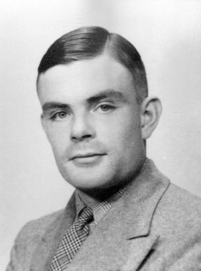
Alan Turing, a brilliant mathematician who was a key facet in breaking the encryptions of infamous enigma machine in WWII, proposed a simple yet striking question in 1950. In his paper titled Computing Machinery and Intelligence, he simply asks “Can machines think?” (Turing). At a deeper level, Turing was interested in understanding what it means to think. If a machine is able to undergo the same logical progressions as a human would to the degree which a machine and human can no longer be distinguished, then what would constitute the rejection that such a machine is not thinking?
This relatively newfound field has a vast array of implications, ranging from image recognition to assist in identifying rejected components in a manufacturing process to eliminate subjectivity, to diagnostics for patient illnesses, there are many fields that can be vastly improved by this technology.
Image Credit (1)
Abstract
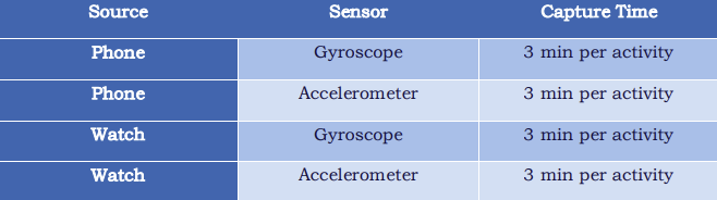
Per the paper WISDM Smartphone and Smartwatch Activity and Biometrics Dataset, data was collected for 51 subjects who performed “18 diverse activities of daily living” (Weiss). Data was collected using four different methods, which is detailed in the table below.
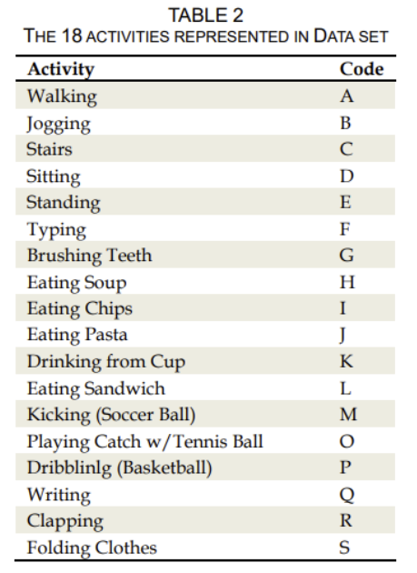
Per each of the data sets constituting each user, the data was identified per activity as shown in the table below, which is sourced from WISDM Smartphone and Smartwatch Activity and Biometrics Data Set, as below.
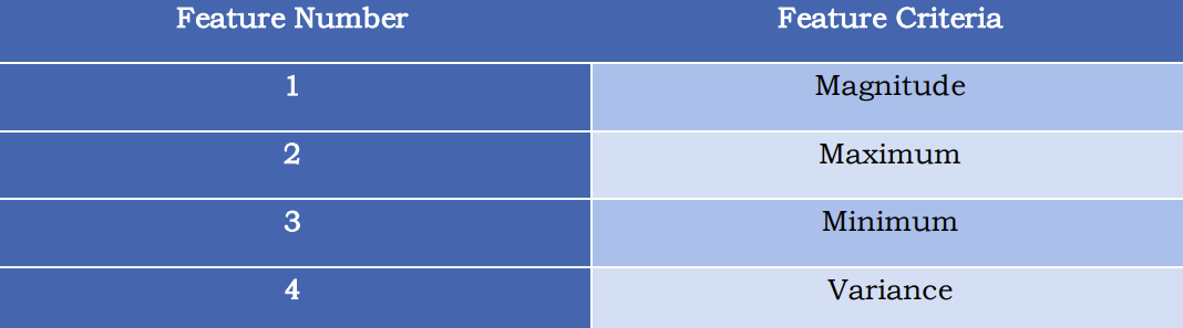
Data cleaning was performed to sort the data and normalize the time based on these inputs. Once the data was organized into the R environment, several features were created to be used for predictive modeling. This includes finding the magnitude of the sensor data as to eliminate orientation variability across user sensing sources, as well as the minimum, maximum, and variance of the sensing data.
Once feature engineering was complete, the data was split using a 70/30 separation, and stored for model testing. It was found that due to the shear size of the data collected, model prototyping was severely time-consuming. As a result, the data was compressed (i.e. approximately 1 – 5 seconds per user per activity was used) to facilitate rapid model prototyping. Four general models were generated, which are listed below:
1) Multinomial Linear Regression
2) K-Nearest Neighbors
3) Random Forest
4) Support Vector Machines (Linear, Sigmoid, Polynomial, and Radial Kernels)
It was found that the KNN model performed the best in predicting each activity, having a maximum accuracy of 96.98%. Therefore, it was concluded that for future work, the KNN model would be further developed and tested using cross validation.
Data Cleaning
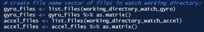
The data provided was given in four different directories identified in the grouping as shown in figure 1. For the sake of explanation, the watch gyroscope data will be used to discuss the data importing process, which is identical to the data import process for all other activities. Once the working directory was defined for the desired data set, a file name vector was created:
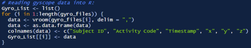
Each file was extracted using the vroom package with allows for high speed data importing, which was performed with the following for loop.
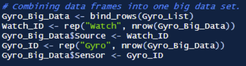
Finally, the data is combined into one large data set by using the bind rows function available in the dplyr package. Then, this data is saved as an RDS file for future import.
Upon inspection, albeit the source of this data states that the data is represented in LINUX time, this is simply not the case. However, given that the sampling rate is 20Hz over the course of 3 minutes, it was found through inspection that the time is presented in nano seconds:

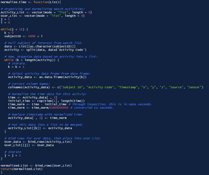
In order to normalize the time for each user, several observations must be recognized, which are listed below:
1) Each RDS import for the phone and watch data contains all 51 users, both with data logging from the gyroscope and the accelerometer.
2) Per each user, each activity begins with a unique LINUX time.
Therefore, the large data frames imported as an RDS must first be separated by user. Once the individual user data is imported, the data must be separated per activity, and then the time for each activity would be normalized. Once normalized, each activity would be stored in an activity list, which would then be bound into one data frame. This would then constitute the data for one user, which would also then be stored into one data frame, which would later be bound for a final data frame containing all user data. The function normalize.time was created to achieve this goal, which is able to separate the data and perform the normalization. The function is shown below. This function was then applied to the four datasets as described earlier, and saved as RDS files for plotting.
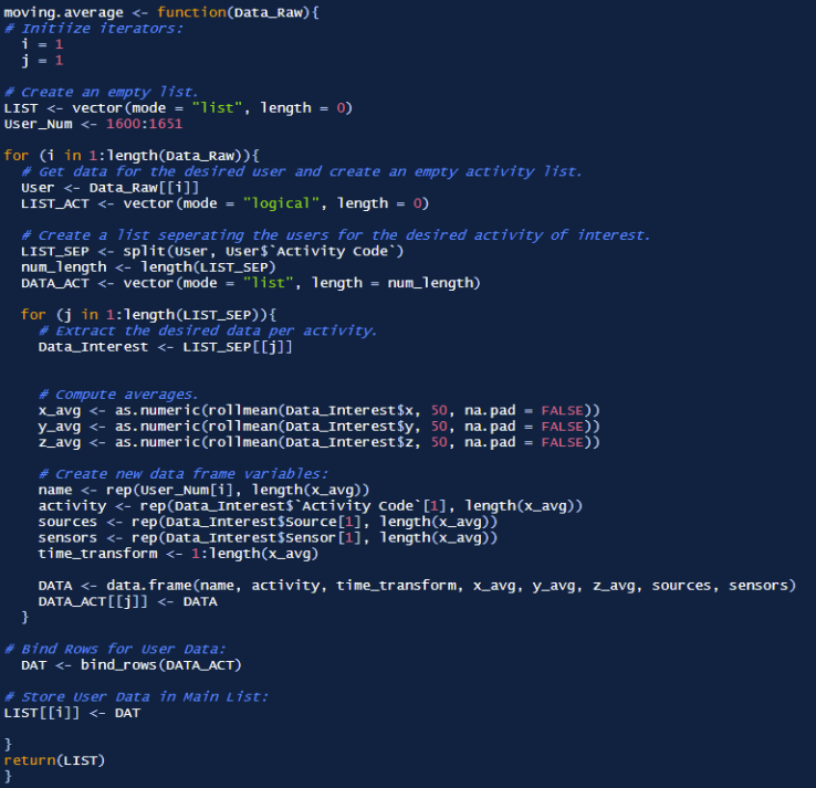
Feature Engineering, Step 1: Moving Average
In order to attenuate noise, a centered moving average was performed with 50 sample windows. The function for this moving average is shown below:
Key plots for these data sets are discussed below. Notice that as prepared in the WISDM Smartphone and Smartwatch Activity and Biometrics Data Set, the data can be separated based on which device source (phone versus watch) are most active in capturing the true activity data. This can be visualized in the following scatter plots, using writing accelerometry as an example:
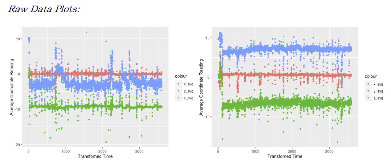
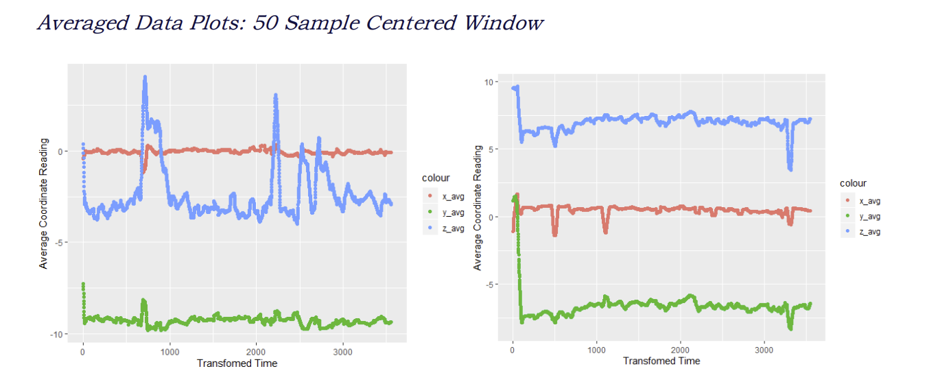
Clearly, the moving average allows for an easier interpretation in the trends associated with the data. Additionally, the moving average helps smooth the data, and therefore attenuates noise, whereby outliers may lead to anomalies and errors in activity prediction. Some qualitative observations become apparent:
1) Coordinate readings appear to have both statistically significant and insignificant total averages per user. That is, user 1600 shows some overlap with xyz data, while no overlap seems to exist with user 1651.
2) Average trends do not seem similar between each user, suggesting that a regressive approach is not appropriate.
3) Maximum and minimum ranges appear to be equivalent between the two users.
Specifically, point 3 is significant since this will help guide how certain activities can be categorized. For instance, consider user 1626 who is eating pasta (activity J). If it is assumed that the user is sitting down, it would be reasonable to think that there would be far greater noise in the watch accelerometry data versus the phones. Refer to the moving averages below:
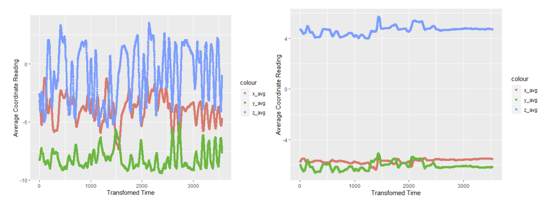
There is an issue, however, with performing the data smoothing. Consider the activities of running versus walking. The motions of walking and running may be considered similar (swinging arm for watch, rotating leg for phone). The differences, however, lie in the cadence of movement, as well as the amplitude of the sensor readings.
When smoothing data however, albeit noise is attenuated, this noise can represent spikes caused by the rigor of the activity (running more so than walking). When the data is smoothed, however, these spikes being attenuated makes it more difficult to differentiate between similar activities. This becomes especially apparent when comparing activities such as writing to typing.
In light of this, albeit some degree of smoothing may improve data interpretation, determining the optimized moving average window that does not alias the data would be involved, and goes beyond the scope of this investigation. Therefore, data smoothing has been eliminated from this analysis.
Feature Engineering, Step II: Gyroscope and Accelerometer Magnitude Representation
Before conducting the two-sample t-test, we have to recognize some important considerations. The first is that there is no certainty to where the phone is located on the user while performing an activity, and upon review of the WISDM Smartphone and Smartwatch Activity and Biometrics Data Set, there is no specification of where the phone is to be located. Of course, it can be assumed that most people keep their phone in a pants pocket. However, there are certainly cases where users may keep their phone in a jacket pocket, on an athletic arm strap, or in other various locations, which may lead to different interpretations of the data.
Perhaps a much more important consideration with the data, especially with the phone, is that there is no certainty with how the phone may be oriented within a pocket. This means that, when comparing individual coordinate data, it’s difficult to compare two sets of data if the orientation is different between these two sets. Consider the diagram below for reference, with the analogy of a spinning disk.
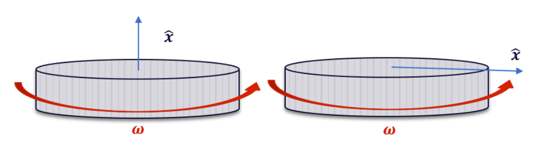
Given the above, both figures show the same operating conditions. That is, they are rotating at the same angular velocity 𝝎. However, due to the different coordinate orientations, upon interpreting the coordinate data, the two operating conditions would appear completely different.
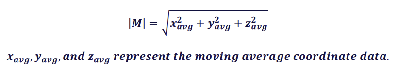
To resolve this issue, the next step in the feature engineering procedure is to represent the coordinate data as a magnitude rather than three separate coordinate representations. As a result, orientation becomes irrelevant, which may lead to more reliable comparisons between each user.
Note that the magnitude of the coordinate outputs, which will be represented as |𝑴|, is given by the following:
The function magnitude was made to determine the sensor magnitudes, which is shown below:
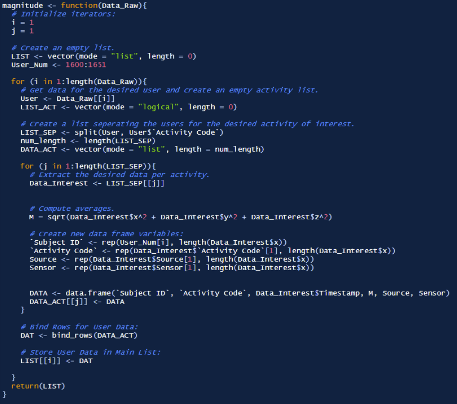
Once the magnitudes were determined, the data was visualized using ggplot to qualitatively understand the different activity trends. Each plot was made per activity, containing the data for all 51 users. The code used to create this visualization is shown below:
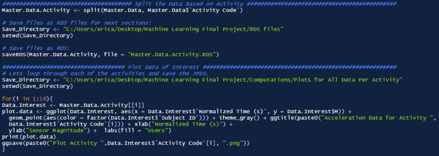
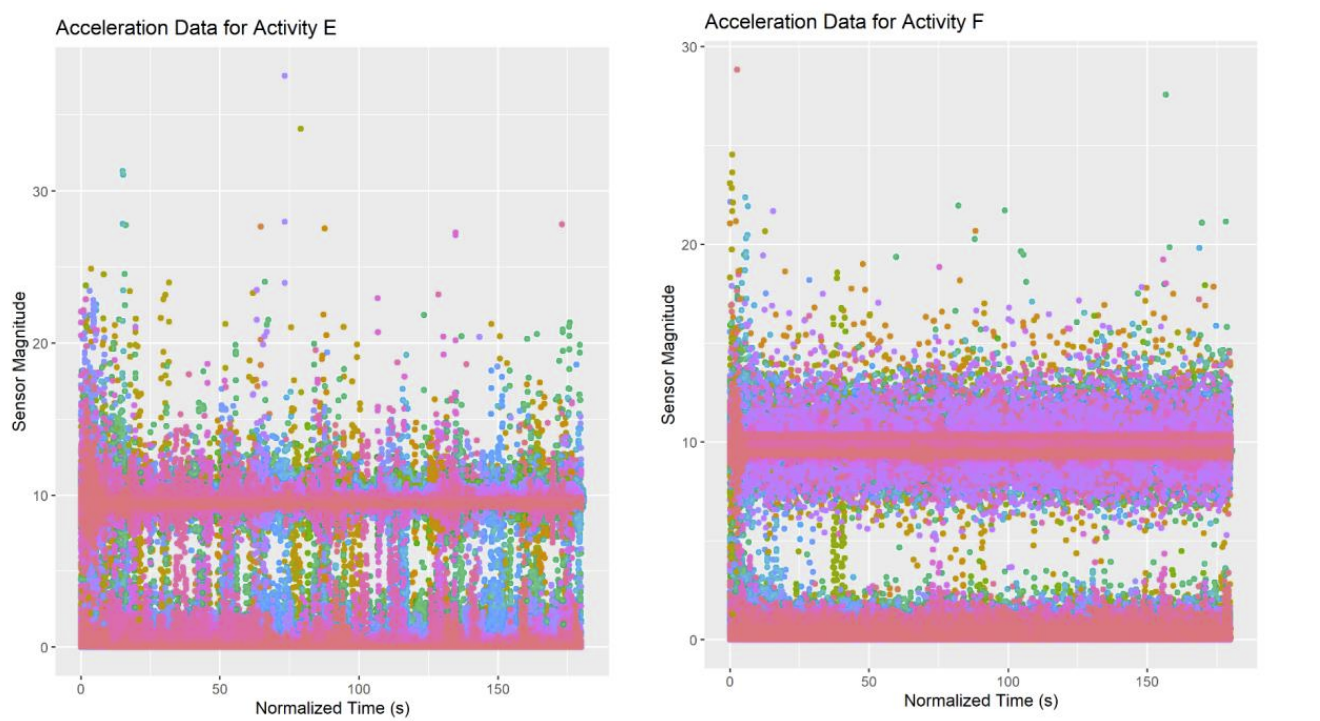
Examples for plots E and F are shown below. All plots can be found in the final paper at the end of this page.
Notice that activity M, user 1600 still has duplicates that should have been removed with the unique() function. In order to fix this, we simply remove the data values over 200 seconds. This is performed with the following:
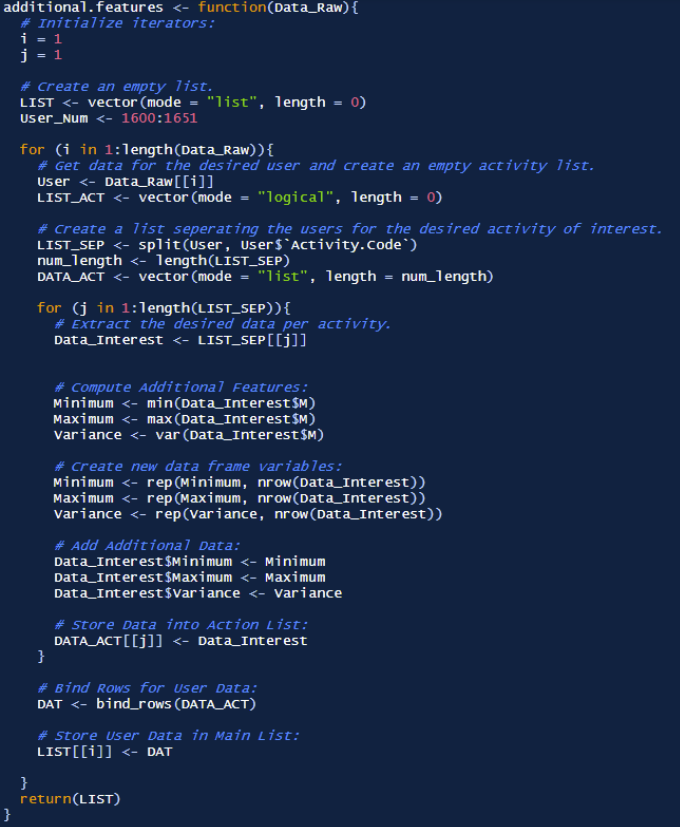
Feature Engineering Step III: Additional Features, Min, Max, and Variance
The last features we will include in our data is the minimum, maximum, and variance of the data per user, per activity. This was created with the methodology shown below. Note that the data extraction methods are similar to that of the moving average, however instead different operations to find the minimum, maximum, and variance are made. Additionally, these values are repeated across all the rows once determined, albeit the return is only one numeric value (this simply keeps the data frame dimensions consistent). The code developed to perform these operations is shown to the right:
Splitting and Compressing Data for Model Prototyping
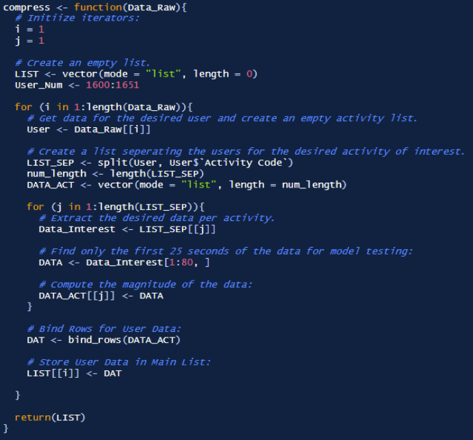
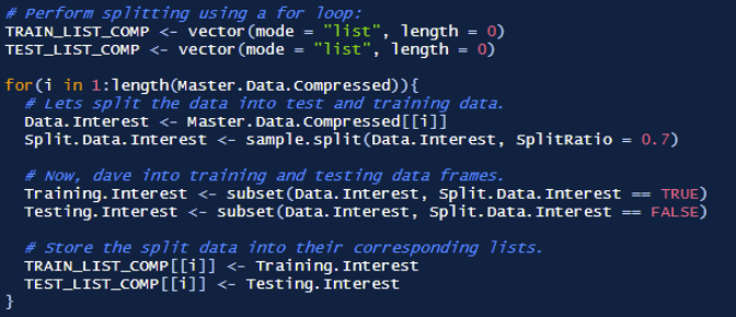
Now that all the features have been developed, it is time split the data. However, it is important to recognize the scale of the data being used. If the current data was used for all users, and all activities, there would simply be too much data to develop models in a timely manner.
In order to speed up the prototyping process, the first 5 seconds (80 samples) of each activity per user would be used as the total data. Then, this data will be split into testing and training data, which then would be used for model development and testing. Finally, once the optimal model is developed, 100% of the data would be used to train and test the data, with a standard 70/30 data split. The first image shows the function responsible for extracting the first 80 samples of user data, while the second image shows the function that performs the 70/30 split.
Model 1: Multinomial Classification Regression
The first model generated is a multinomial regression. This model is unlike a standard linear regression in that the multinomial method can perform non-binary class identification. That is, instead of simply classifying data in two categories (which is the maximum capable in a standard linear regression), a multinomial regression can perform multi-class identification. Despite this ability, it will be clear that the linear model performs poorly in accounting for the plethora of non-linear effects present in the data. The model first proceeds with parameter optimization through 100 iterations.
Once the optimization is complete, a multinomial model was developed and run for the first 5 seconds of each activity for each user. Albeit some predictions were made, the model yielded only a 16% accuracy. The multinomial model is shown below, which uses the magnitude, source, sensor, minimum, maximum, and variance as the predictive parameters.
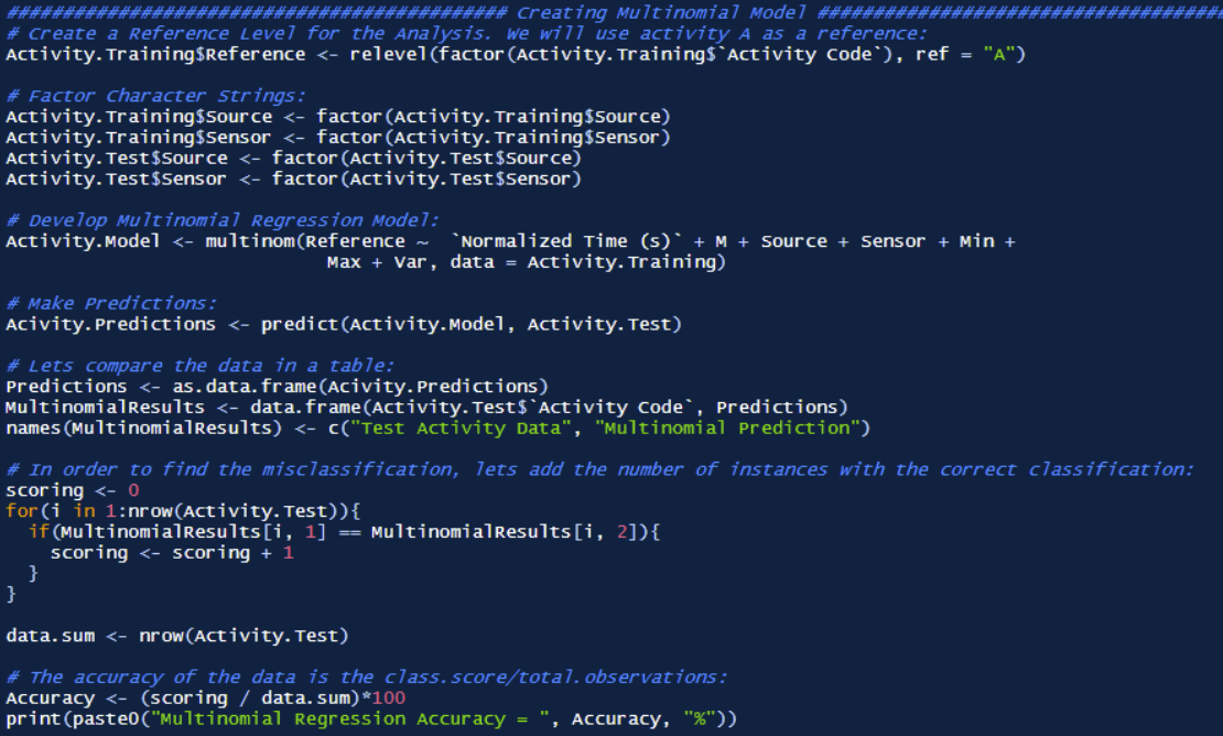
Again, the tremendously low accuracy highlights the shear non-linearity of the data. It is clear that any linear models will not be able to handle such nonlinearity, and thus other models must be utilized to account for such a phenomenon.
Model II: K-Nearest Neighbors (KNN)
K-Nearest Neighbors (KNN) is a statistical method that involves forming a Bayesian decision boundary around a point to classify the data point. As mentioned in the paper KNN Model-Based Approach in Classification, “the k-nearest Neighbors is a non-parametric classification method, which is simple but effective in many ways” (Guo). Moreover, the paper specifies that KNN is a “case-based learning method, which keeps all the training data for classification” (Guo). A successful visual representation of the KNN method is seen in the research article titled Application of K-Nearest Neighbor (KNN) Approach for Predicting Economic Events: Theoretical Background, which is provided below (KNN, Approach for Predicting Economic Events: Theoretical Background):
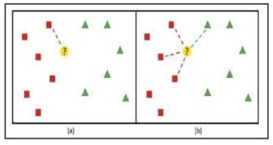
Note that the decision data point ? is classified by evaluating the neighboring points, and forming a probability model to classify the point. In the case of figure 20 (b), K = 4, and there are more red data points than green data points. Therefore, the probability of the data point belonging to the red classification group is higher, and therefore the data point ? is specified as the red class.
This approach is useful for the purposes of classifying each activity. Note that per the KNN model developed, the following features will be specified as classification criteria. See the KNN model below.
In order to determine the model accuracy, a for loop was created to classify score the properly classified activities compared to the test data. This score was then divided by the total number of classifications, which yields the model accuracy. Note that this method for determining the model accuracy will consistently be used among future modeling techniques.
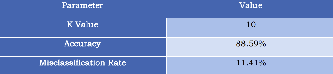
As an initial run, the K value was set to 10. The results of the KNN model were far more promising than the multinomial model. These results are shown below.
Comparing this to the Multinomial Model, the KNN results yield a 435.94% increase in the accuracy. This is exceptionally better, therefore supporting the observation that the linear multinomial modeling technique is not a suitable method for the desired activity classification.
Optimization of the K-Nearest Neighbors (KNN) Model
As an exploratory analysis, lets take some time to investigate how different values of K affect the accuracy of the KNN model. For this investigation, The data was compressed further to 5 samples per activity, per user. This was performed to speed up the analysis and provide a general trend to the accuracy behavior across different K values. This means that per activity, approximately total of 255 samples were present for evaluation.
To perform the evaluation, a KNN model was iterated from K values at 1 to 100. This is shown below:
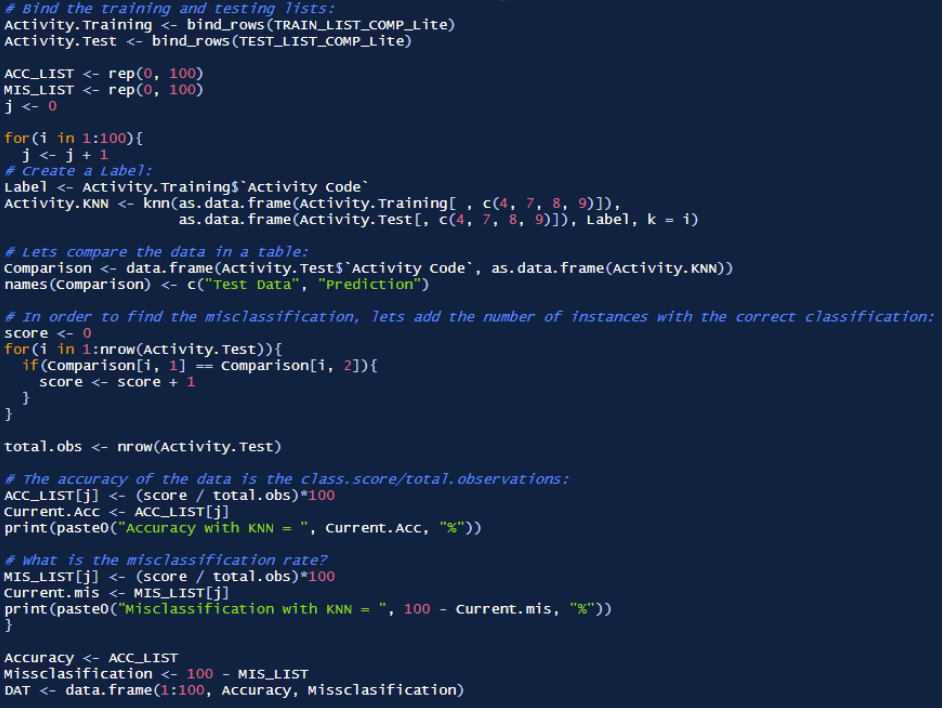
Once the iterative analysis was complete, the accuracy and misclassification rates were plotted using ggplot. The results from this analysis are presented
In light of this information, we re-ran the study with a lower K value (i.e. K = 1), which greatly improved the accuracy to 96.98%. The results are shown below:

Model III: Random Forests
Random forests are a statistical method which can be very powerful. As specified in Classification and Regression by random Forest, Random Forests is a statistical technique that falls into a category called “ensemble learning”(Wiener). Specifically, this type of learning relies on “methods that generate many classifiers and aggregate their results”(Wiener). The paper specifically mentions two forms of decision tree manipulation, which is “boosting and bagging”(Wiener).
Random forests are generally considered a bagging technique, however its statistical approach “add[s] an additional layer of randomness to bagging”(Wiener). Specifically, unlike standard trees, random forest trees ae constructed whereby “each node is split using the best split among all variables” (Wiener).
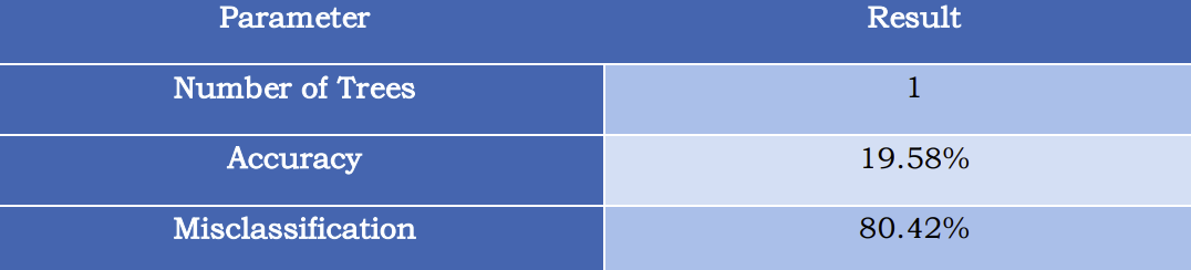
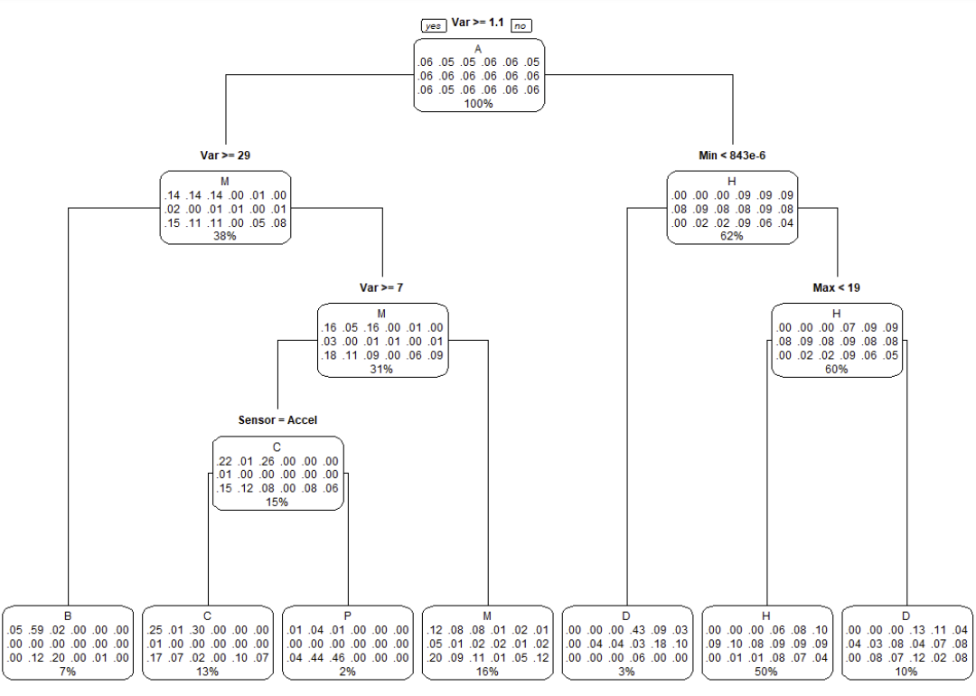
A random forest model was created to potentially improve the accuracy of the model. Prior to making a random forest, a single decision tree was created for predictions.
Unfortunately, using a single decision tree yielded an accuracy below 20%. A summary of the results is shown below, with the decision tree provided.
When performing the random forest, it was found that there is not enough memory to perform the analysis.


Model IV: Support Vector Machines
Support Vector Machines (SVM) is a statistical method used to separate grouped data based on specified decision boundaries. Based on the data collected, is can be assumed through inspection that the data is not linear. As mentioned in the paper Support Vector Machines Explained,
“In order to use an SVM to solve a classification or regression problem on data that is not linearly separable, we need to first choose a kernel and relevant parameters which you expect might map the non-linearly separable data into a feature space where it is linearly separable”(Fletcher)
In our analysis, we will focus our attention to comparing a linear SVM to three different non-linear approaches, listed below:
1) Sigmoid
2) Polynomial
3) Radial
Each model follows the general form below, with the kernel changed per each nonlinear method:

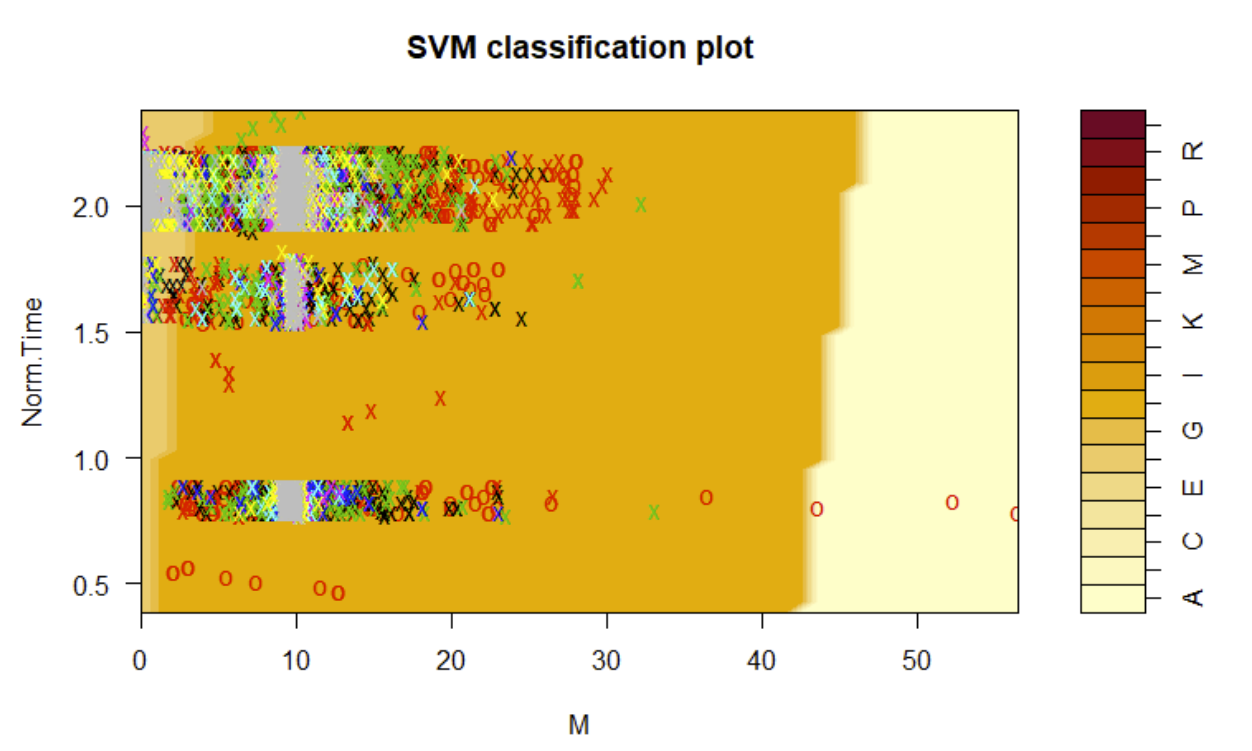
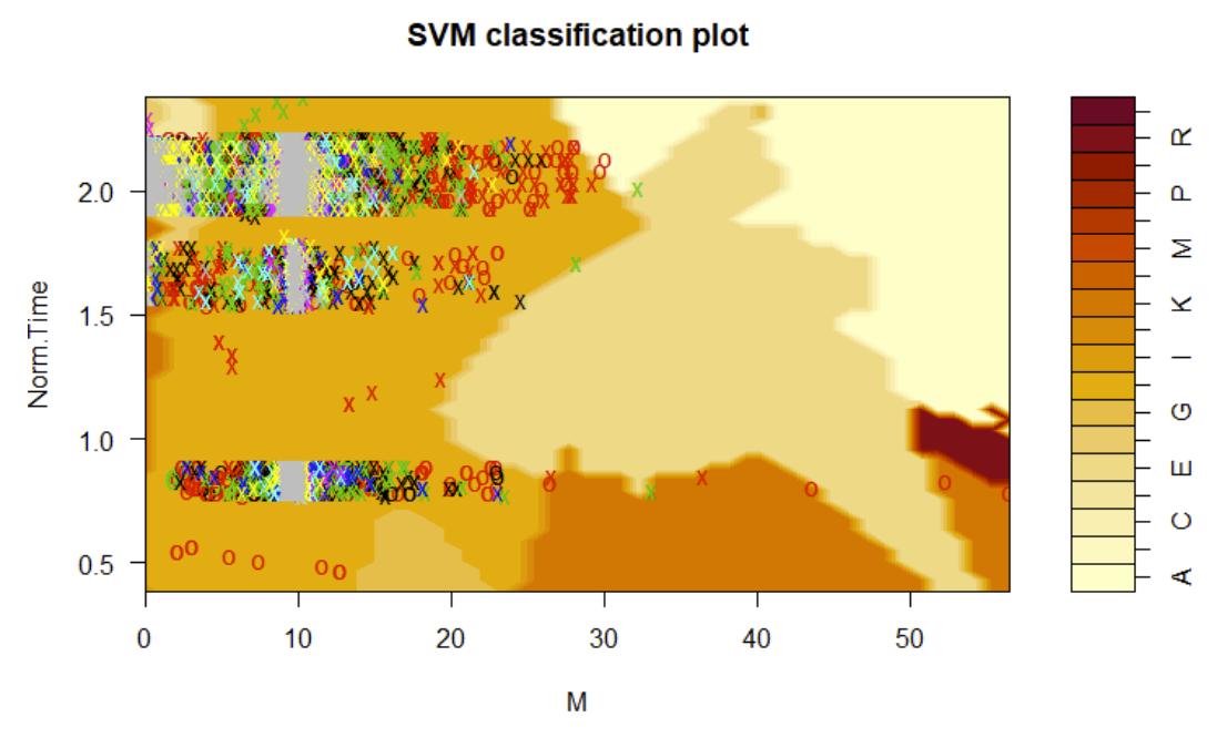
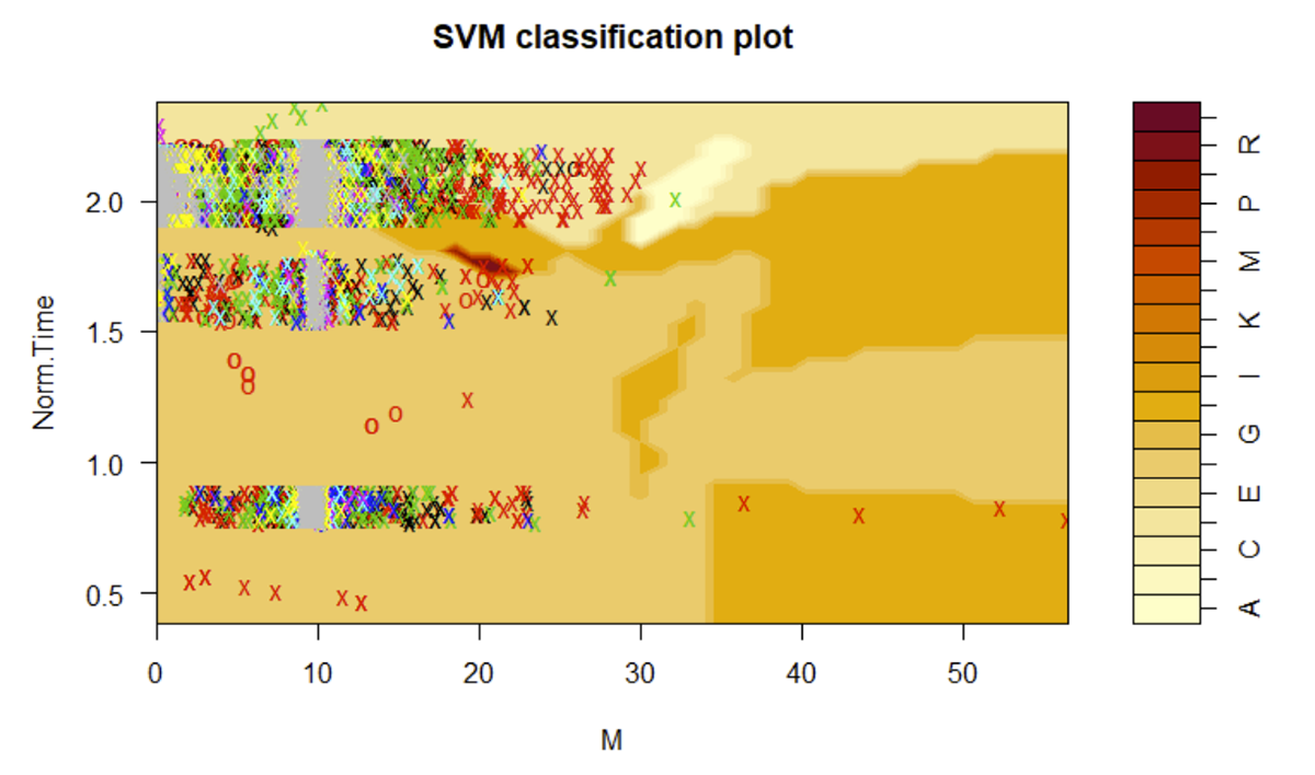
In creating the four different SVM models, classification plots were generated for each case, these are shown below:
Linear Support Vector Machine Classification Plot
Polynomial Support Vector Machine Classification Plot
Radial Support Vector Machine Classification Plot

Sigmoid Support Vector Machine Classification Plot
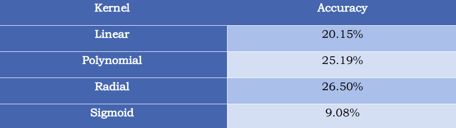
Furthermore, the corresponding model accuracies are shown below, with the radial kernel proving to be the most effective, albeit all kernels output a substantially low accuracy.
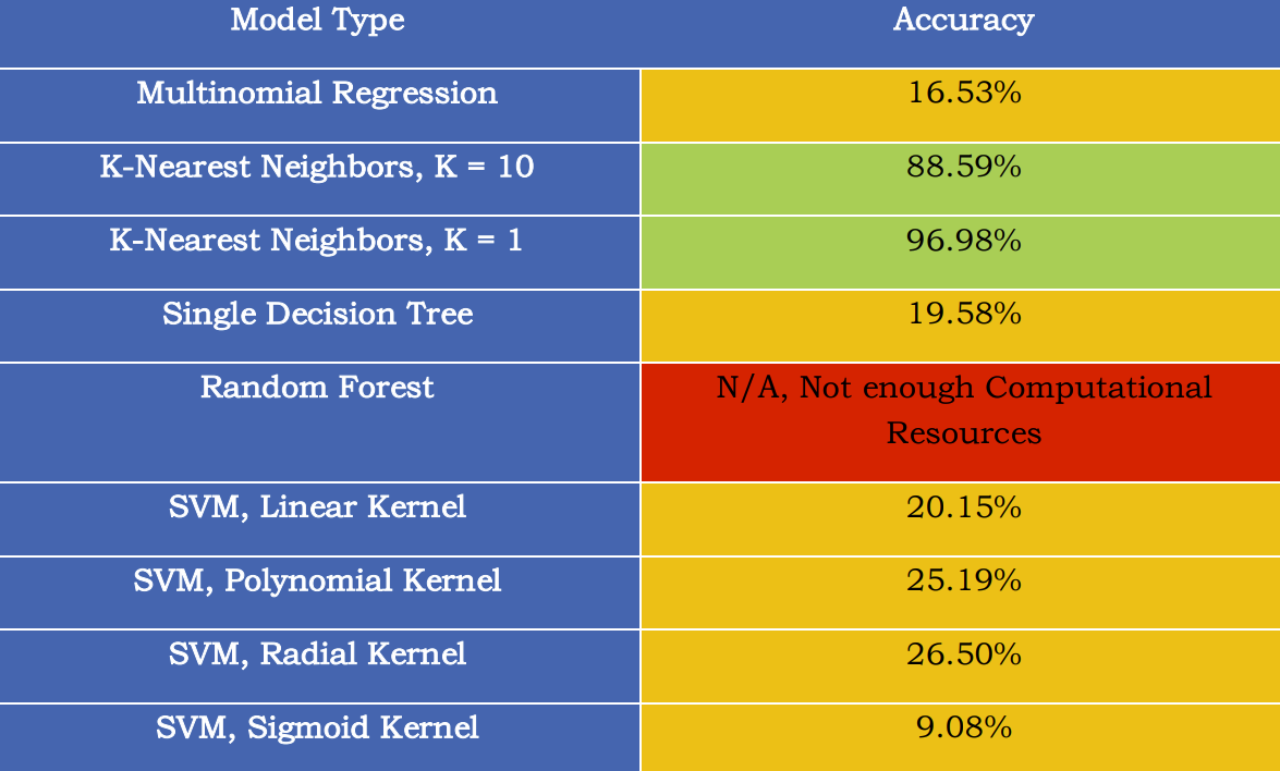
Predictive modeling proves to be an effective tool in classifying activity data collected among the 51 users observed. Albeit most of the predictive models proved to yield low accuracies, K-Nearest Neighbors performed exceptionally well. A summary of the model accuracies is shown below:
Conclusion
As for future work, KNN appears to be the most applicable model for the data collected, and therefore further development to this model would be encouraged. Possible future exploration with this data set can be done so by:
1) Optimizing the run time of the KNN model.
2) Performing a cross validation to assess a more realistic representation of the model accuracy.
3) Use all 51 users completely as training data and collect new data from different users to assess true model accuracy.
4) Develop live KNN predictive modeling solutions for device tracking.
References
(1) “Alan Turing.” Encyclopædia Britannica, Encyclopædia Britannica, Inc., https://www.britannica.com/biography/Alan-Turing.
(2) Abdullahi, Aminu. “What Is Machine Learning?” CIO Insight, 27 May 2022, https://www.cioinsight.com/big-data/what-is-machine-learning/.